
Step 1
Create a new 1024 x 786 px document. Set the Foreground color to
#464646 and the Background color to #363636, pick the Gradient Tool, click the Radial Gradient icon in the Options bar, then click and drag from the center of the document to one of the corners.
Place the White diamond plate texture on top of the gradient background then change its layer’s Blend Mode to Overlay and its Opacity to 70%.

Place the Texture7 on top of both layers, and change its layer’s Blend Mode to Multiply.

Step 2
Create the text in any light color using the font Age. The Size is 300 pt and the text is in All Caps. Also, change the Tracking value to 100 to increase the space between the letters.

Change the text layer’s Fill value to 0.

Double click the text layer to apply a Stroke effect:
– Stroke
- Size : 25
- Position : Center
- Color :
#000000
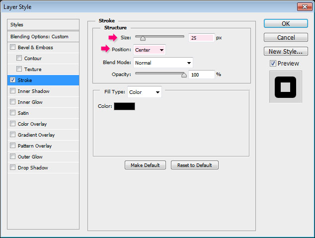
Make sure to increase the Tracking value if you are using a bigger font or Stroke sizes.

Step 3
Duplicate the text layer then make it invisible by clicking the eye icon next to it.

Next, we want to rasterize the copy text layer AND its Layer Style. In Photoshop CS6, you can right click the layer and choose Rasterize Layer Style, which is a new cool feature in CS6.
In older versions, you’ll need to group the layer, then right click the group and choose Merge Group.

Duplicate the rasterized layer.

Step 4
Double click the copy (copy 2) rasterized layer to apply the following Layer Style:
– Bevel and Emboss
#ffe9ac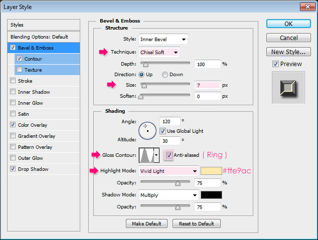
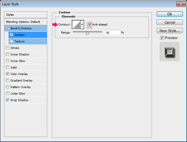
– Contour
- Check the Anti-aliased box.
– Color Overlay
- Color :
#a6a6a6 - Opacity :
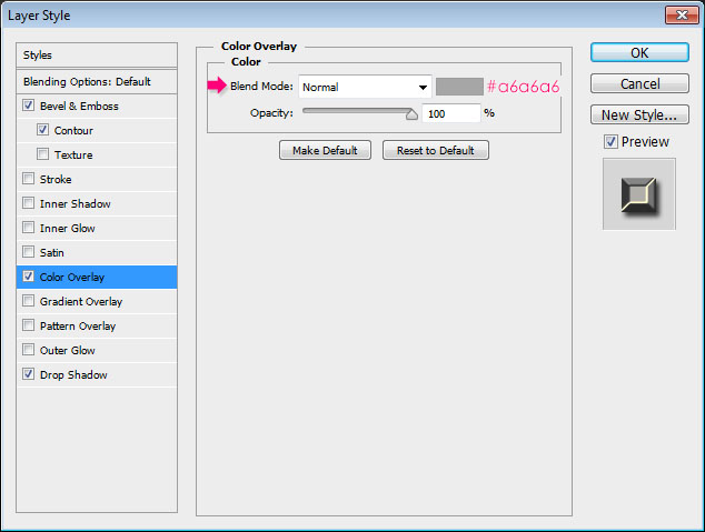
– Drop Shadow
Use the default values.
Use the default values.
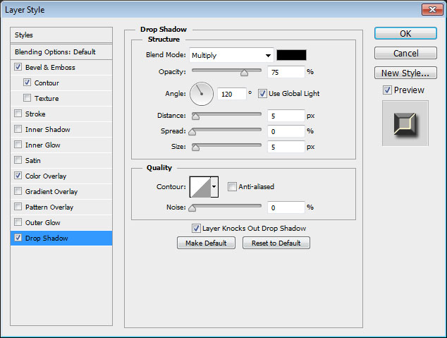
This will create the shiny iron effect.

Step 5
Place the Seamless metal texture smooth image on top of all layers, then Ctrl/Cmd + click the rasterized layer’s thumbnail to create a selection.

Press Ctrl/Cmd + J to duplicate the selection in a new layer (copy and paste). Then, delete the original texture layer as we don’t need it.

Go to Image > Adjustments > Levels, then change the Shadows value to 30 and theHighlights value to 240.

Change the texture layer’s Blend Mode to Hard Light. This will add a nice texture to the iron text, making it look more realistic.

Click the original rasterized layer (copy) so that it is the selected layer. Then go to Filter > Blur > Motion Blur, and set the Angle to 90° and the Distance to 30. This will intensify the shadow vertically, adding more depth to the text.

Step 6
Open the Brush panel (Window > Brush) and choose a soft round brush. Modify its Settings as shown below:
Brush Tip Shape

Shape Dynamics

Scattering

Dual Brush
Choose the 90 px Sampled Tip brush.
Choose the 90 px Sampled Tip brush.

Step 7
Right click the original text layer (not the rasterized ones) and choose Create Work Path.

Create a new layer right on top of the original text layer and below the two rasterized layers, rename it to BG Sparkles, and change its Blend Mode to Pin Light. Then, pick the Direct Selection Tool, and set the Foreground color to
#fff7e5 and the Background color to#363636.
Right click the Work Path and choose Stroke Path.

Choose Brush from the Tool drop down menu, and make sure that the Simulate Pressurebox is un-checked.

This will stroke the path with some splattered sparkles. Hit Enter/Return to get rid of the path.

Step 8
Double click the BG Sparkles layer and apply an Outer Glow effect:
– Outer Glow
- Blend Mode : Overlay
- Color :
#ffd3be - Size : 10
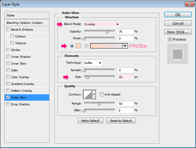
This will apply a nice subtle glow to the sparkles.

Go to Filter > Distort > Wave, and change the values as below:

This will scatter and smudge the sparkles a bit more.

Step 9
Open the Brush panel (Window > Brush) and choose the Star 14 pixels brush. Modify itsSettings as shown below:
Brush Tip Shape

Shape Dynamics

Scattering

Dual Brush
Choose the Star 55 pixels brush.
Choose the Star 55 pixels brush.

Color Dynamics

Transfer

Step 10
Ctrl/Cmd + click one of the rasterized layer’s thumbnail to create a selection.

Open the Paths panel (Window > Paths), then Alt/Option + click the Make work path from selection icon down the panel. This will open the Make Work Path dialog box. Enter 1 for theTolerance value and click OK. Lower values give more precise paths.

This will convert the selection to a work path.

Create a new layer below the BG Sparkles layer and call it Text Sparkles. Right click the BG Sparkles layer, choose Copy Layer Style, then right click the Text Sparkles layer and choose Paste Layer Style. Then, change the Text Sparkles layer’s Blend Mode to Color Dodge.
Make sure that the Foreground and Background colors are still set to
#fff7e5 and #363636, and pick the Direct Selection Tool.
Stroke the path just like you did before, and don’t forget to hit Enter/Return to get rid of the path when you’re done.
The stroke is subtle for now, but it will be brighter after we add some adjustment layers later on.

Step 11
Place one of the Sparkles images (found in the Resources section in the beginning of the tutorial) on top of all layers.
Here’s a cool trick to get rid of the background. We are not going to delete it, instead, we’ll just change the layer’s Blend Mode to Lighten. This will work because the background is very dark, and the sparkles are very bright.
Press Ctrl/Cmd + T to enter the Free Transform Mode, then resize, rotate, and move the sparkle to place it on top of any of the letters as you like.

Do the same with the other two sparkles images.

You can as well use the Hue/Saturation to change the sparkles color if you like (Image > Adjustments > Hue/Saturation).
Step 12
Click the Create new fill or adjustment layer icon down the Layers panel and chooseGradient Map.

Make sure that the adjustment layer is on top of all layers, then change its Blend Mode to Soft Light, and its Opacity to 50%. Click the Gradient box in the Adjustments panel (Window > Adjustments) to create the gradient used.

Click below the gradient bar to add each color stop:
# – Color – Location
- 1 –
#503a23– 0 - 2 –
#985d31– 24 - 3 –
#da8437– 47 - 4 –
#cf8d3f– 73 - 5 –
#edbd41– 100

- Click the Create new fill or adjustment layer icon once again, but choose Photo Filterthis time.

Choose the Warming Filter (85). The Adjustment Layers will add very nice coloring to the effect, making it look brighter and more vivid. They also help blend the different elements together nicely.

Step 13
Create a new layer between the two background texture layers and call it Corners.

Pick the Elliptical Marquee Tool and draw an ellipse that intersects with the edges of the document.

Go to Select > Modify > Feather, and change the Feather Radius value to 50. This will create nice smooth edges for the selection instead of harsh ones.

Go to Select > Inverse to invert the selection.

Fill the inverted selection with
Black.
Go to Select > Deselect to get rid of the selection. This will add depth to the corners instead of creating a flat final result.

No comments:
Post a Comment